Experimental Reproducibility 101 (Part 3)
This article, by Benjamin Schwessinger and Sonali Roy, is the third of three and is based on a workshop called “Reproducibility for all” presented at PlantBio18 by Benjamin Schwessinger, Sonali Roy, and Lenny Teytelman. In Part 1 (here), the authors describe the importance of having a data management plan, and the value of electronic notebooks. In part 2 (here), they discuss ways to share protocols, and data and code repositories. In this final article, the write about how data analysis and data visualization can be made more reproducible.
6. Learn how to perform your big-data analysis reproducibly within a vibrant community and become part of it.
Managing large scale data or analyzing ‘big-data’ files can often be problematic since there are endless software parameters that can be adjusted; this leads to accumulation of a list of different versions of the original file. If not annotated carefully with the ‘why’ an analysis was performed and ‘what’ conditions were used, data interpretation can become challenging.
A good place to begin to learn how to manage data analysis is to look for a data carpentry workshop near you. The carpentry workshops teach the basic skills required to analyze data in a reproducible manner. With software carpentry, researchers can learn bash and git (see below), in addition to either python or R. Data carpentry workshops also teach more specific skills for a certain subject area like genome and RNAseq analysis.
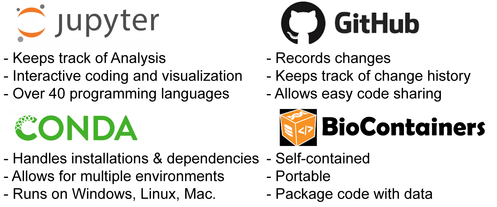
Researches with these basic bioinformatics skills can then enjoy interactive programming either in R studio or the Jupyter notebook ecosystem; both freely available to academics. Jupyter notebooks can help keep track of data analyses and preserve a mix of code, documentation, and visualization. It allows the user to code, visualize and explore data interactively. Jupyter is compatible with over 40 programming languages and can be run remotely on a server.
Data scientists also shouldn’t miss out on version control with git, which together with github makes for a really powerful tool. Instead of having endless versions of the same file users can have one single file that can be adjusted with git at any step. Github further allows code sharing and collaborative contributions to pre-existing codes.
Lastly one of course wonders how to install all these softwares and the softwares they in turn need to run. In the past, this has always been a horrible mess….yet things do sometimes get better. Conda combined with bioconda can help manage software dependencies and environments. Even better at times are containers like docker which come with everything preinstalled and users *just* have to run it.
7. Create effective figures that allow readers to critically evaluate data.
Authors rely heavily on a reader’s ‘visual’ learning skills for information transfer via print media. In manuscripts, this refers to the creation of representative plots, images, graphs, diagrams that summarize experimental data. Given the importance of figures to science communication however, very little or no detail is included in the methods section that describe how figures are prepared. In addition, the primary data i.e uncropped, unaltered images, raw data points are usually not submitted along with the final figure. Finally, even if raw data are submitted, popular softwares such as excel that are used to prepare plots don’t track changes made to the raw data; hindering detection of data manipulation and thereby affecting experimental reproducibility.
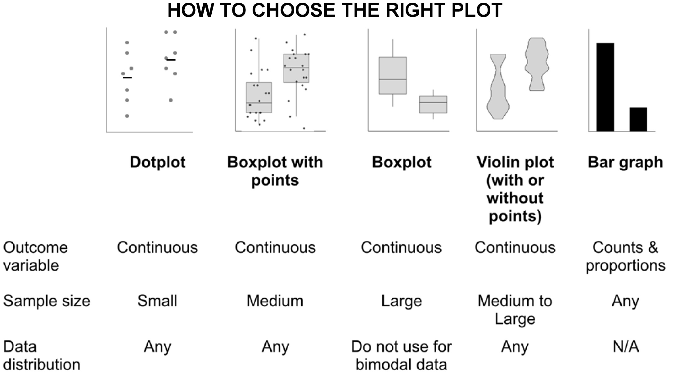
Arguably the most common problem prevalent in the life sciences today is the use of the wrong plot type to visualize data. The bar graph is perhaps the most widely misused plot to represent continuous data. Intended to display categorical data (Mendelian traits of fruit shape wrinkly/smooth, colors- green/yellow) bar charts are also incorrectly used to display descriptive statistics (shoot weight, root length). Readers assume the data are distributed normally and can be represented by a single ‘average’ value.
Instead authors can use the following chart to decide upon the type of plot suited for presenting their data. Users can learn to use the freely available ‘tidyverse’ package on R to make these figures. Alternatively, websites such as this and this allow users to make interactive plots with clickable data points that can be directly embedded into online version of manuscripts.
For more information see here and a very useful twitter thread.